Code Your Own Website
Intermediate HTML + CSS
Class 3
Pizza, anyone?

Welcome! Please fill out the pizza poll at http://tinyurl.com/gdipizzaparty
Let's Download It!
The Viewport Dimensions extension displays the viewport dimensions in the lower right corner of the browser window when it's resized. This is helpful for responsive coding.
 Add Viewport Dimensions to Chrome
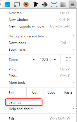
- Click the menu at the top right-hand side and click Settings
- Click Extensions on the left
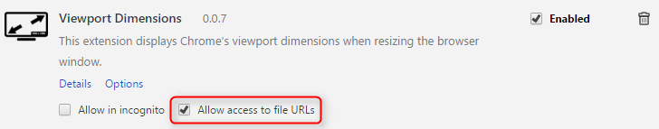
- Check Allow access to file URLs under Viewport Dimensions
- Close and reopen Chrome
Awesome! 👍
Let's Develop It!
- Copy index.html and name the copy africa.html
- Copy index.html and name the copy diet.html
- Copy index.html and name the copy stripes.html
You should now have four identical files with different names: index.html, africa.html, diet.html, and stripes.html
Responsive Grid Systems
What is a grid system?
CSS for columns with margins, which is used to align content (Example »)
 Grid systems use relative units (e.g. % and vw) instead of fixed units (e.g. px) so that the layout adjusts according to the viewport width
At narrower breakpoints (e.g. tablet or mobile), each column expands to fill the viewport in a single column
Why do we ♥ grid systems?
- Easier to Maintain: It's easier to design and code new layouts when the structural guidelines have already been decided
- Usability: Uniformity and consistency are key to creating a website that your users will find easy to navigate, read and understand
- Abides by the 'Rule of Thirds': Helps avoid arbitary design decisions. For developers, this means there are less layout exceptions to account for.
- Faster to Code: At different breakpoints, we can easily collapse everything into a single column
- Fluid: Fluid layouts are the way of the future ☺
Grids Are Everywhere!
Popular Frameworks
Based On Grids
Most frameworks are on 12 columns or 16 columns, and include styling for common elements such as headings, buttons, and tables
But wouldn't you rather say you made your own grid system?
Coding Your Own Grid System
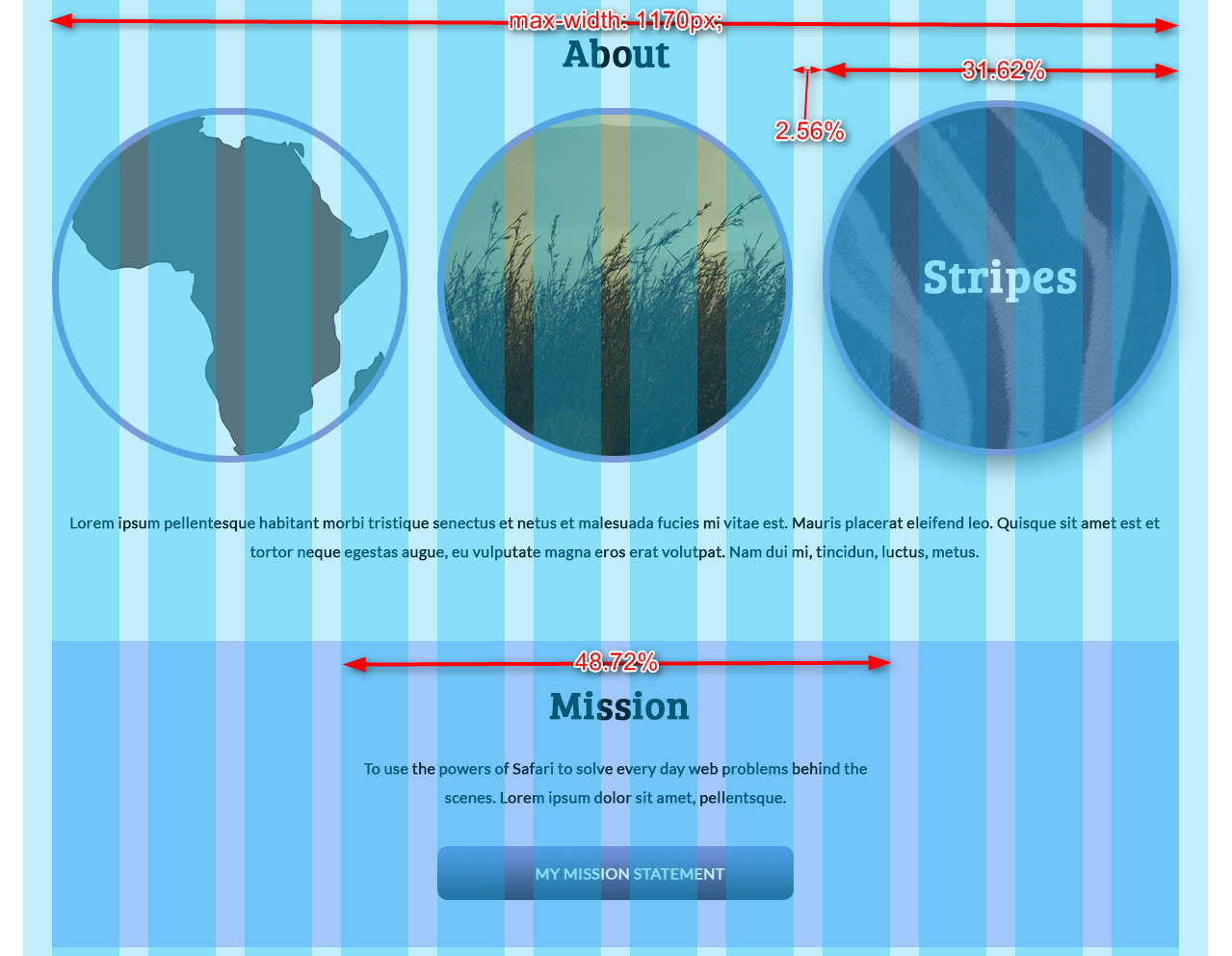 Determine the maximum width from the design. In our case, that's 1170px. This will be used as a
 max-widthon each row.- Calculate the gutter (the margin between columns) width as a percentage of the maximum width. In our case, that's 2.56% (or 30px/1170px).
- Use a grid generator to generate the CSS. (But don't worry — we've done this for you!) Then reference these classes in your HTML.
Grid System HTML
Our grid CSS was generated with a grid generator, but the unneccessary CSS has been removed. Today we'll be focusing on using the grid system in the HTML.
Use the row class on each row of content:
<section class="row">

</section>
Within the row, use the column class and the width class (e.g. span_4_of_12) on each column of content:
<section class="row">
    <div class="column span_4_of_12">
        I'm the first of three columns!
    </div>
    <div class="column span_4_of_12">
        I'm the second of three columns!
    </div>
    <div class="column span_4_of_12">
        I'm the third of three columns!
    </div>
</section>
Tip: To use multiple classes on a single element, separate each class with a space in your HTML as shown above.
Let's Develop It!
Let's put our grid system to use in the HTML!
- Copy the grid CSS from tinyurl.com/gdibostongrid into your CSS file. Now it's ready to use in the HTML!
- Add grid HTML to index.html, then style the About and Mission sections
- Add grid HTML to africa.html, diet.html, and stripes.html. We'll style these pages next week!
Responsive Images
To make images fit to their containers, some extra properties are required:
img {
    max-width: 100%;
    box-sizing: border-box;
}
Together these two properties force images to stay within their containers
See the Pen Responsive Images - Before by Liz Shaw (@anythingcodes) on CodePen.
Let's Develop It!
- Let's make our images truly responsive!
- Let's also make our About images circular with a border.
Gradients
You can now make gradients with CSS3 — no image-editing required!
Use background-image with linear-gradient:
selector {
    background-image: linear-gradient(red, white);
}
The first is the top color, while the second is the bottom color
See the Pen Linear Gradients - Two Values by Liz Shaw (@anythingcodes) on CodePen.
Gradients
Bonus Functionality
You can use as many values as you want, and specify where the gradient should begin:
See the Pen Linear Gradients by Liz Shaw (@anythingcodes) on CodePen.
You can even make radial gradients
To save yourself some time, bookmark the Ultimate CSS Gradient Generator
Let's Develop It!
Let's add a linear gradient to our Mission link!
Feel free to use the Ultimate CSS Gradient Generator
Media Queries
Visit your page and narrow the browser window
The columns you set up are fluid and responsive, since they respond to the viewport width, but don't collapse into a single column
How do we make that happen? With media queries
Media Queries
Within each media query rule, put CSS rules you would like to override for that breakpoint
@media screen and (max-width: 600px) {
    .column {
        margin: 1% 0;
        width: 100%;
    }
    .some-other-class {
        background-color: yellow;
    }
}
Always use media queries at the end of your CSS file
Tip: Remember to watch your closing brackets!
Common Media Query Uses
- To force columns to stack and fill up the whole screen width (what we'll be doing):
See the Pen Media Queries - Columns by Liz Shaw (@anythingcodes) on CodePen.
- Showing or hiding content at various breakpoints:
See the Pen Media Queries by Liz Shaw (@anythingcodes) on CodePen.
Recommendations
The temptation is to add breakpoints based on whatever device is popular at the time (e.g. 768px)
This is a bad idea

After all, responsive design is about any and every potential screen size!
The Golden Rule: Keep it fluid
Add a breakpoint where your design breaks
Let's Develop It!
Let's add a mobile breakpoint to make the columns take up the entire viewport!