Code Your Own Website
Intermediate HTML + CSS
Class 2
First, some housekeeping
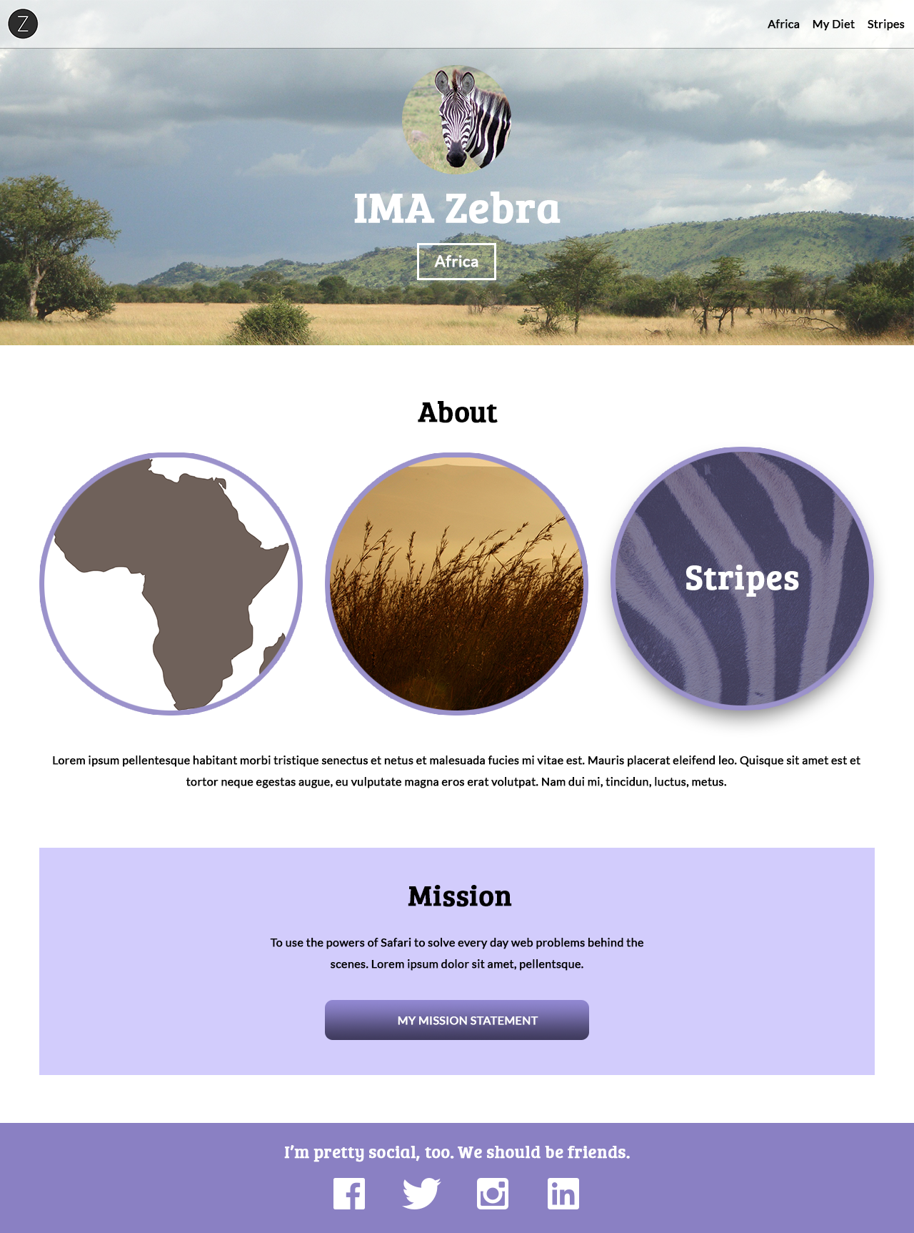
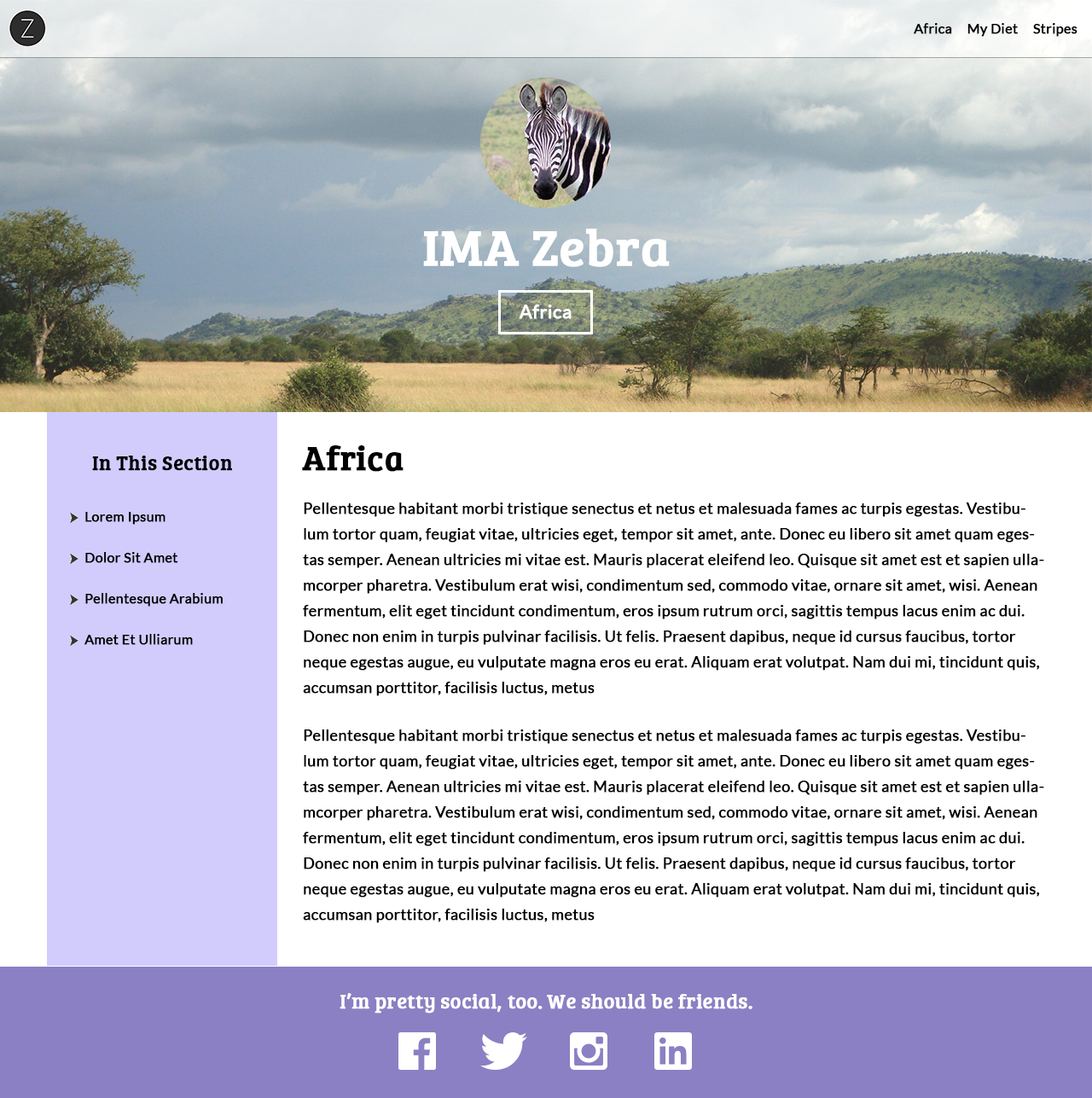
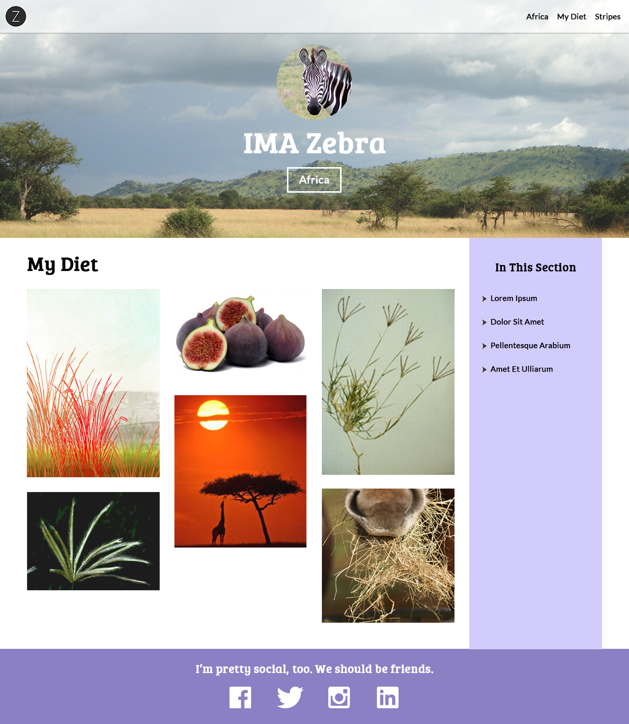
Let's Develop It!
- Open your
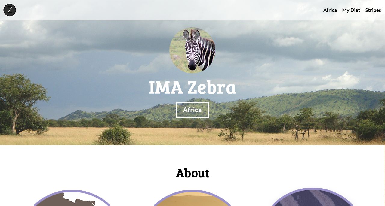
index.htmlfile from last week and change My Home to Africa - Link Africa to
africa.html, My Diet todiet.html, and Stripes tostripes.html
Our Class Project
We're going to code several different page templates
- Homepage
- Africa (a two-column template with a left sidebar)
- My Diet (a two-column template with a right sidebar)
- Stripes (a one-column template)
Let's Get Coding!
Property: border-radius
border-radius rounds the corners of an element
No image editing required! The border-radius property is part of CSS3 (the latest version of CSS)
border-radius with Four Values
Clockwise from the top left
selector {
    border-radius: topLeft topRight bottomRight bottomLeft;
}
img {
border-radius: 10px 30px 60px 150px;
}
becomes
border-radius with Two Values
selector {
    border-radius: topLeftAndBottomRight topRightAndBottomLeft;
}
img {
border-radius: 10px 150px;
}
border-radius with One Value
selector {
    border-radius: all;
}
img {
border-radius: 40px;
}
Using border-radius to Make an Element into a Circle
selector {
    border-radius: 50%;
}
img {
border-radius: 50%;
}
Note: The element must be square to make a perfect circle.
Otherwise border-radius: 50%; will make an oval.
Let's Develop It!
Let's make our profile image into a circle
CSS Coding Tip #1
Organize your CSS by section and use comments for each section
/* Header */
header {
position: fixed;
top: 0;
left: 0;
width: 100%;
background-color: rgba(255, 255, 255, 0.54);
}
nav {
float: right;
}
/* Banner */
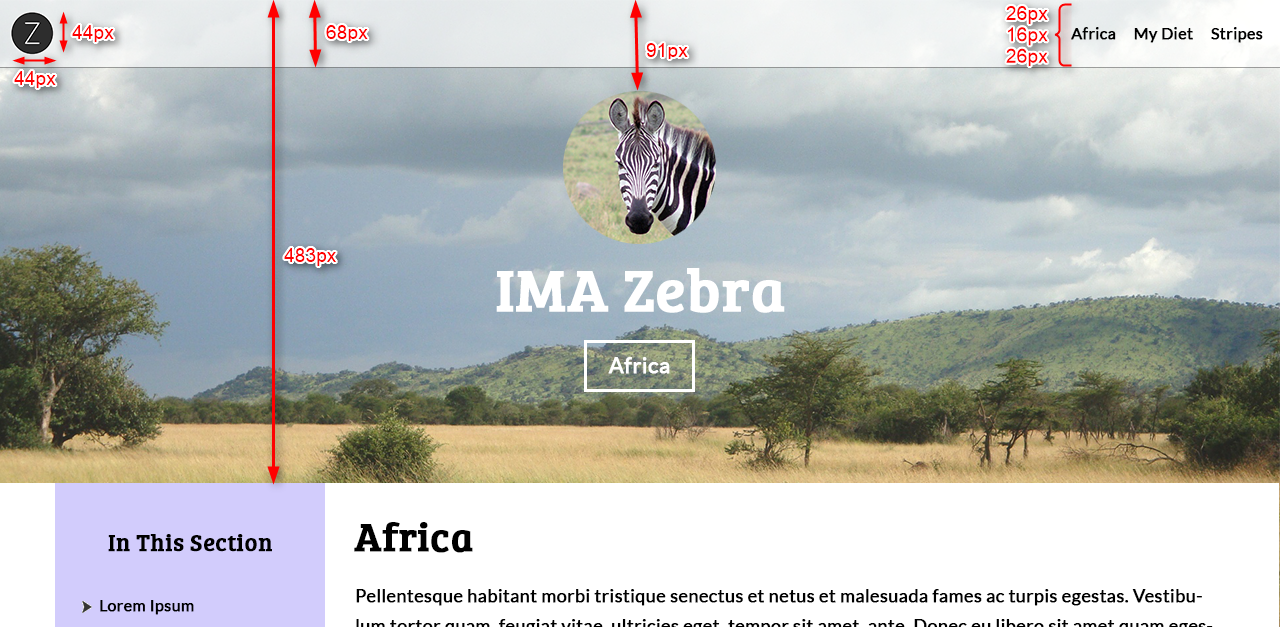
#banner {
height: 483px;
}
#banner img {
width:154px;
border-radius: 50%;
}
This will make your life much easier down the road, as you add more CSS
Custom Fonts
Add some pizzazz to your page
Meet Google Web Fonts
Tired of using the same old, boring "web-safe" fonts?
(No offense, CSSFontStack.com)
Use Google Web Fonts! Google has hundreds of free fonts that have been optimized for the web, and are ready for us to use!
Google Web Fonts don’t rely on fonts installed on users’ computers
Instead, these fonts are stored on Google’s servers and served to your website (like an image from another server is served to your website)
Custom Fonts in Our Design
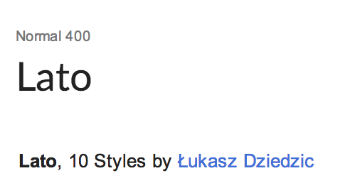
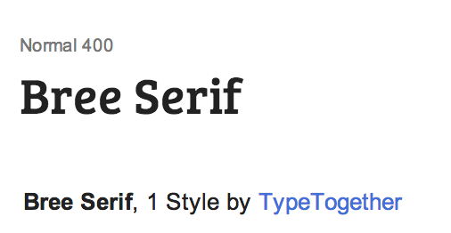
In our design, we've used Lato for the body and Bree Serif for the headlines
You can use any fonts you'd like!
How To Use Google Fonts
- Search http://google.com/fonts and add fonts to your collection (we recommend 1-2 fonts per site)
- Within your HTML file:
- Paste the Standard HTML that Google prepares for you above the
<link>to your CSS file<link href='https://fonts.googleapis.com/css?family=Lato|Bree+Serif' rel='stylesheet' type='text/css' />
- Paste the Standard HTML that Google prepares for you above the
- Within your CSS file:
- Use the
font-familyproperties Google providesbody { font-family: 'Lato', sans-serif; }
- Use the
Let's Develop It!
Add some Google Web Fonts to your site
Let's Develop It!
While we're at it, let's also clean up our header and banner/hero to match the design
Developers typically get these measurements from Photoshop
Coding Process Tip #1
Make your global, site-wide elements first
For example, our project's header, banner/hero, and footer are global, site-wide elements
Styling the Navigation
Recap of display:inline; versus display:block;
See the Pen Inline vs. Block by Liz Shaw (@anythingcodes) on CodePen.
Block elements push sibling elements to another line. Inline elements allow sibling elements to sit to their right and left.
Houston, we have a problem
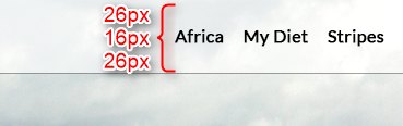
Our navigation links need:
- To allow other links to their left and right
... meaning we need adisplayvalue that doesn't force sibling elements to a new line
(likedisplay:inline;) - 26px of top and bottom padding to push down the content (e.g. "Africa")
... meaning we need adisplayvalue whose top and bottom padding is relative to the box itself, not relative to the text baseline
(likedisplay:block;)
But these needs are at odds with one another! 👎
Enter
display:inline-block;
Property: display
| Inline | Block | Inline-Block | |
|---|---|---|---|
| Can have a set width & height | ✗ | ✔ | ✔ |
| Allow other elements to their left & right (i.e. don't force sibling elements to new line) |
✔ | ✗ | ✔ |
| Respect left & right margins | ✔ | ✔ | ✔ |
| Respect top & bottom margins & padding | ✗ | ✔ | ✔ |
| NEW: By default is as wide as its content | ✔ | ✗ | ✔ |
Let's Develop It!
- Let's use
display:inline-block;on our navigation's anchor links and add a hover state - We'll also use
display:inline-block;on the banner'sspanso we no longer need to set a width
Bonus Question: Where is the 16px coming from?
SVG
SVG: Scalable Vector Graphic
SVG graphics do not lose any quality if they are zoomed, which is perfect for modern retina displays
By comparison, raster graphics (PNGs, JPEGs, GIFs, etc.) lose quality when zoomed
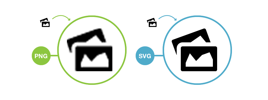
SVG Uses
SVGs are typically used for typography, icons, and other graphics with clearly-defined lines, while raster graphics are typically used for photography
SVGs are often used for animation, since each component of an SVG can be animated with CSS
Using SVG within <img>
Reference the .svg file like any other image:
<img src="image.svg" alt="My image" />
SVG is so new that only modern browsers support it
If you need to support older browsers, save a copy of your SVG as a PNG, then use the PNG as a fallback within the onerror attribute:
<img src="image.svg" alt="My image" onerror="this.onerror=null; this.src='image.png'" />
Tip: Use caniuse.com to check browser compatibility of modern HTML5 & CSS3 features
Let's Develop It!
Let's add SVG icons to our footer!
Since we need to add a top margin to our <li>s, display:inline-block; will also come in handy here.

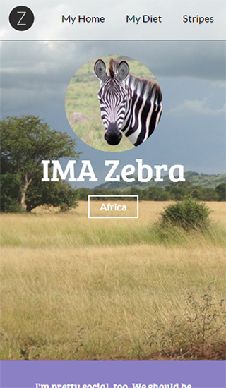
Responsive Setup
Browser View
Minimize your browser window. Things should look responsive!
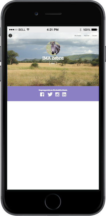
Responsive Setup
Device View
On an actual device, however, things look rough:
How do we make our page load responsively in devices?
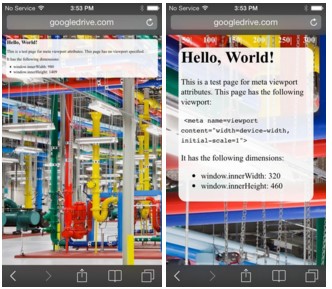
Add a viewport
Without a viewport, mobile devices will render the page at a typical desktop screen width, scaled to fit the screen
Add the following to the <head>:
<meta name="viewport" content="width=device-width, initial-scale=1" />Emulating a Device
Chrome has a built-in emulator where you can preview how your page might look on a device
- In Chrome, right-click your page and click Inspect Element
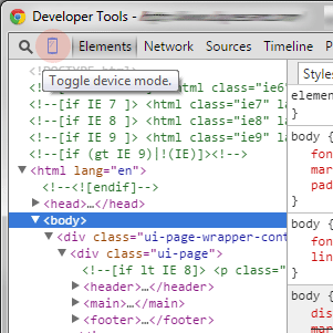 Within the Developer Tools panel, click the Toggle device mode icon (
 )
)- Choose from the Device from the menu and then refresh the page
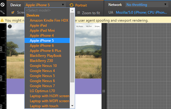
- Click the Toggle device mode icon () to stop emulating
Emulating a Device
Other Options
- BrowserStack
- Safari's Inspector - Plug your Apple device into a computer and troubleshoot on an actual device — not an emulator!
Let's Develop It!
Let's add a viewport to your page!
<meta name="viewport" content="width=device-width, initial-scale=1" />
Once we're done, let's check out the page in Chrome's emulator
Animation time!
Property: transition
The transition CSS property lets us create awesome animations without any Javascript
Each transition property value requires:
- The CSS property you want to animate (e.g. width)
- The duration of the effect in milliseconds or seconds (e.g. 2s)
selector {
    transition: width 2s;
}
How do you trigger animations?
With a state change (:hover, :checked, :focus, etc.)
Every animation has a before selector and an after selector
Before Selector: The element as it is naturally
After Selector: The element when it is interacted with (e.g. when it is hovered over)
Before and After Selectors
In the before selector, apply transition along with what properties change during the transition
The after selector indicates the values after a transition is complete. Never use transition on the after selector.
| Before Selector | After Selector | Example |
|---|---|---|
|
|
Example (before) » Example (after) » |
|
|
Example (before) » Example (after) » |
Let's Develop It!
Let's add a transition to our navigation menu links!