Code Your Own Website
Intermediate HTML + CSS
Class 4
Pizza!

Help yourself to some pizza in the kitchen!
Got a minute?
Take our special topics workshops survey!
http://tinyurl.com/gdispecialtopics
First, some housekeeping
Let's Develop It!
- Open styles.css in your text editor and change
:first-of-typeto:first-child - Open index.html in your text editor and change
:first-of-typeto:first-child
Now if you view index.html in your browser, it should look jacked up ☺ — let's fix that!
| Selector | Definition | Example |
|---|---|---|
:first-of-type |
The :first-of-type selector styles the first sibling of its type (e.g. specific tag and class) that is a child of its parent element |
Example » |
:first-child |
The :first-child selector styles the first child of its parent element, regardless of type |
Example » |
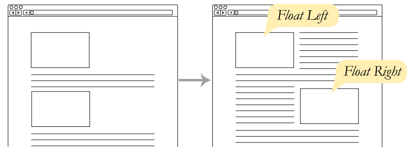
So how does a grid system work?
Recap: Grid System
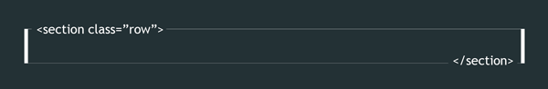
Use the row class on each row of content:
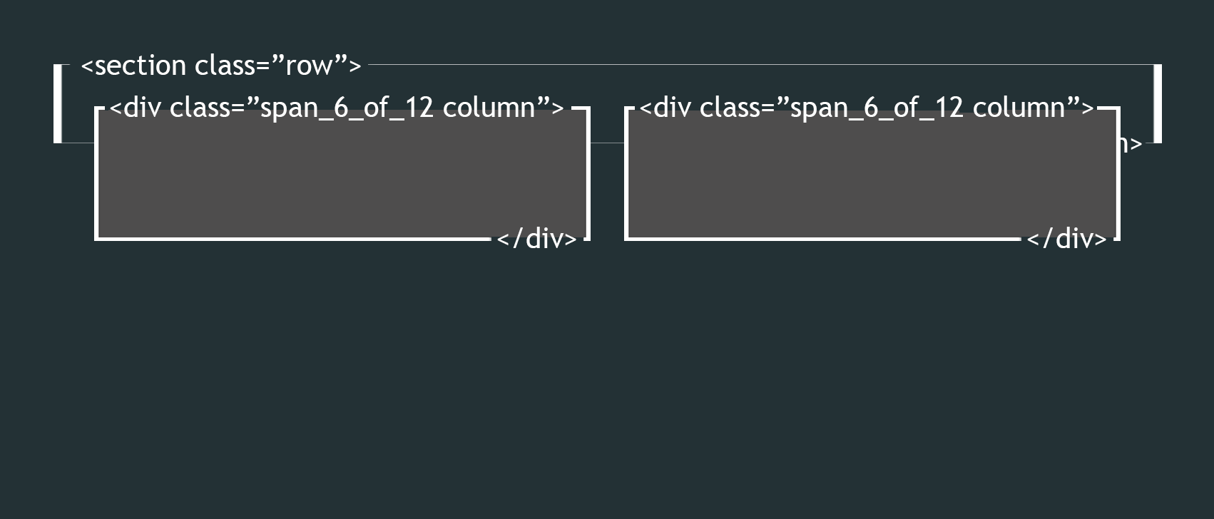
<section class="row">

</section>
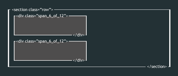
Within the row, use the column class and the width class (e.g. span_4_of_12) on each column of content:
<section class="row">
    <div class="column span_4_of_12">
        I'm the first of three columns!
    </div>
    <div class="column span_4_of_12">
        I'm the second of three columns!
    </div>
    <div class="column span_4_of_12">
        I'm the third of three columns!
    </div>
</section>
Property: clear
When an element is floated, subsequent elements wrap around it
The clear property prevents floated elements from appearing on a specific side (left, right, or both)
See the Pen Clearing - Before by Liz Shaw (@anythingcodes) on CodePen.
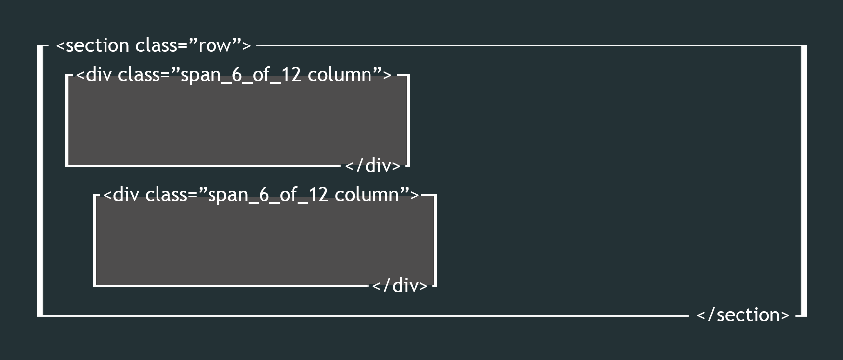
Grids Under The Hood
Each row:
- Has columns
Each column:
- Has a width, which is set by the span_X_of_12 class
- Has a left margin (except for the 1st column in the row)
- Is floated left so columns stack side-by-side
✗ The Problem?
Floating takes columns out of normal flow, preventing columns from contributing to the height of their container!
The Clearfix Method
✔ The Solution
The row clears floats, which properly:
- adjusts the height of the row
- prevents subsequent elements from wrapping around the columns
How? With an :after pseudoelement, which injects content at the end of an element
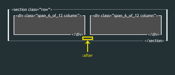
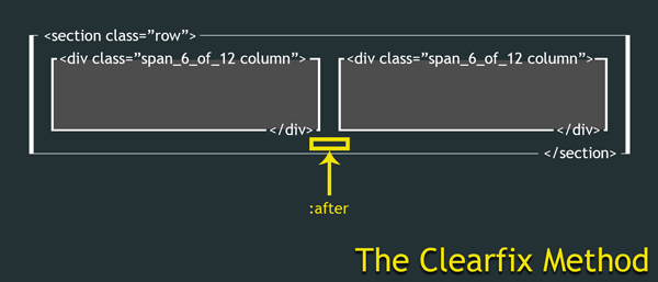
The Clearfix Method
We use :after to inject an empty cleared, block-level pseudoelement at the end of each row
.row:after {
    content: '';
    clear: both;
    display: block;
    visibility: hidden;
    height: 0;
}
Tip: If you don't have the content property, :after won't work. visibility and height are optional, but address problems in older browsers.
Since :after acts as the last item in our row (after the columns), it clears the float at that point and sets the row height properly
Memorize this ☺ — it comes up all the time!
Let's Develop It!
Use the grid system with HTML5 elements to make our Stripes page
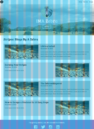 Open stripes.html and structure the article area using HTML5 elements:
<main> <article> </article> </main>- Add grid classes to the HTML
Selector: :nth-child()
selector:nth-child(odd) {
    background: red;
}
The :nth-child() selector allows you to pick specific child elements to style
You can use a keyword (e.g. even or odd), number (e.g. 2), or formula (e.g. 3n + 3)
See the Pen The nth-child Selector by Liz Shaw (@anythingcodes) on CodePen.
Let's Develop It!
- Open stripes.html and add a <div> for each blog post
- Add an image to each <div> (use http://placehold.it/455x186), then add a headline, date, and descriptive paragraph
- Use the
:nth-child(even)and:nth-child(odd)selectors to alternate each blog post's background color
Homework 1:
- Make each blog container resize to fit its content like so:

- Use the
:nth-child(even)and:nth-child(odd)selectors to alternate thefloatvalue for each image (left or right) like so: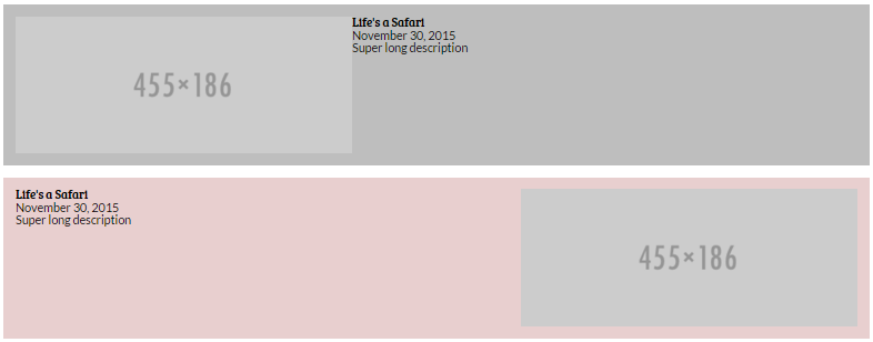
- Style the text to your liking
Homework solutions will be emailed on Sunday
Let's Develop It!
Let's get semantic! Use the grid system with HTML5 elements to make our Africa and Diet pages.

 Open each file and structure the sidebar and the article area using HTML5 elements, such as:
<main> <aside> <nav> </nav> </aside> <article> </article> </main>- Add grid classes to the HTML
- Let's also add a sidebar class to the sidebar and style that!
The :before Selector
As a counterpart to :after, :before injects content at the beginning of an element:
p:before {
    content: 'Read this: ';
}
See the Pen The :before Pseudoelement by Liz Shaw (@anythingcodes) on CodePen.
Using images
in :before and :after
p:before {
    content: url('your_image_path.png');
}
See the Pen The :before Pseudoelement with Images by Liz Shaw (@anythingcodes) on CodePen.
P.S.
Pseudoelements (:after and :before) are awesome
Learning to use the :before and :after pseudoelements in CSS »
Homework 2:
Try to style your sidebar like the design!
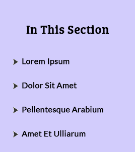 Save the image at http://anything.codes/img/li-content.png and put it in your images folder
- Create an unordered list of links in the HTML, if you haven't already
- Use
:beforeto place this arrow image before each item - Make other sidebar-specific styles to match the design, as needed — you'll need to override other styles!
Homework solutions will be emailed on Sunday
Sidebar Heights
We commonly see sidebars that take up the entire height of the main content area:

This is possible with floats, but hardly fun!
Why Floats?
Why Floats?
Browser support — effectively all browsers support the float property (IE6+, Firefox 2+, Chrome 1+, etc.)
But there are new CSS3 alternatives
to make our lives easier!

Hurray!
Introducing Flexbox
Flexbox
Flexbox: Flexible Box Model, the latest and greatest CSS3 offering
It was created largely because of common responsive development problems — float is great, but it requires too much extra attention!
The central idea is that flexbox keeps your layout fluid by doing a lot of the math for you!
Example: Use flexbox on a parent container. Its children will automatically have the same height — set child dimensions only if you need to!
Using Flexbox
Set display:flex; on a parent container.
selector {
    display: flex;
}
Now all children will have the same height, unless that height was set elsewhere
Let's Develop It!
Let's solve our sidebar height problem using flexbox!
Flexbox is magical
You can do a lot more with flexbox, including:
- Reordering elements at different breakpoints
- Calculating widths dynamically (awesome for Content Management System, or CMS, work ❤)
- Easier vertical alignment
Articles & Examples:
'Using Flexbox Today' by Chris Wright »
'Solved by Flexbox' by Philip Walton »
What are the drawbacks?
Flexbox is so new that you will need to use vendor prefixes until the simple non-prefixed display:flex; is supported in a browser:
selector {
    display: -webkit-box;  /* iOS 6-, Safari 3.1-6 */
    display: -ms-flexbox;  /* IE 10 */
    display: -webkit-flex; /* Safari 6.1+. iOS 7.1+ */
    display: flex;         /* MODERN VERSIONS: Firefox, Chrome, Opera */
}
Order matters! The non-prefixed version should always go last.
Don't memorize this! Use shouldiprefix.com
Common Vendor Prefixes
- Firefox: -moz-
- Safari: -webkit-
- Internet Explorer: -ms-
- Opera: -o-
... but really, don't memorize this.
Use shouldiprefix.com.
Polyfills
Old browsers (for example, IE 9 & below) were made before flexbox existed; these browsers don't know what flexbox is
You can use a polyfill, which is code that replicates the functions of a modern HTML5 or CSS3 feature for browsers that don't support that feature natively
Flexie is a flexbox polyfill
A variety of polyfills exist for other modern CSS3 properties and HTML5 elements
Use caniuse.com to check if a certain HTML5 or CSS3 feature is supported. If not, google for a polyfill!
Mobile Menus
Press the down arrow or spacebar to view
Mobile Menus
We can use CSS3 to make a nifty mobile menu!
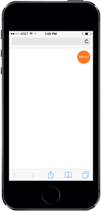
We know:
- About absolute positioning
- About animations using
transition - About the viewport width (
vw) unit - About
max-widthandmax-height - About hiding elements at different breakpoints
- A lot! (good job! 👍 )
We need to know:
- About the checkbox
<input>s,<label>s, and the:checkedselector - About sibling selectors
The checkbox <input>
 The
The <input> element specifies an input field, usually in a form
Use the type="checkbox" attribute to make a checkbox:
<input type="checkbox" />
Why a checkbox?
Because we can use the :checked selector as an animation trigger state!
If it's checked, we'll show the mobile menu
The checkbox <input>'s <label>
<label>Toggle the checkbox!</label>
The <label> element is used for labeling form elements, and is the clickable text for toggling a checkbox
To link a label with a checkbox, use the for="" attribute. The for value should be the same as the checkbox's id value, for example:
<input type="checkbox" id="toggler" />
<label for="toggler">Toggle the checkbox!</label>
See the Pen Associating a label with a checkbox by Liz Shaw (@anythingcodes) on CodePen.
Sibling Selectors
In the HTML, we'll place our checkbox before the menu's <ul>
Then, in the CSS, we'll show the <ul> if the checkbox is checked — we can do this with a sibling selector!
.our-checkbox ~ .our-unordered-list {
    max-height: 0;
}
The above targets an element with class our-unordered-list if it is preceded by a sibling element with class our-checkbox
See the Pen :checked and the sibling selector by Liz Shaw (@anythingcodes) on CodePen.
Putting It All Together
Now that the label is clickable, we don't need to see that ugly checkbox — hide it with display:none;
We're going to use max-height:0; and overflow:hidden; on the before state of our navigation menu's <ul>
When the box is checked, we'll animate max-height to become 100vh.
See the Pen :checked and the sibling selector by Liz Shaw (@anythingcodes) on CodePen.
Let's Develop It!
Let's make a mobile menu!
Masonry Layouts
Press the down arrow or spacebar to view
Properties:
column-count and column-gap
 Masonry layouts have become popular lately, largely thanks to sites with infinite scrolling such as Pinterest
Now we can make them much more easily with CSS3!
.masonry {
    column-count: 3;
    column-gap: 3;
}
column-count and column-gap also need vendor prefixes — check shouldiprefix.com!
Bricks
Each item in a masonry layout is usually called a brick and has some additional styling:
.brick {
    display: inline-block;
    width: 100%;
    margin: 0 0 1em 0;
}
.brick img {
    width: 100%;
}
Masonry Layout Demo
See the Pen CSS Masonry Layout by Liz Shaw (@anythingcodes) on CodePen.
Feel free to copy this to your diet.html page!
Opacity and Shadows
Press the down arrow or spacebar to view
Animation Recap
- Add
transitionto the before state - Remember:
transitionaccepts two values,
the CSS property and the duration of the animation
| Before Selector | After Selector |
|---|---|
|
|
Animating Multiple Properties
To animate multiple properties, separate each effect with a comma
selector {
    transition: width 2s, background 5s;
}
See the Pen Animating Multiple Properties - Before by Liz Shaw (@anythingcodes) on CodePen.
Animating Multiple Properties
Method 2: All Properties
Use all to seamlessly transition all properties from before to after states at the same duration
selector {
    transition: all 3s;
}
See the Pen Transitions Using 'all' - Before by Liz Shaw (@anythingcodes) on CodePen.
Sounds great, right? However, all has performance drawbacks, so use it sparingly! (Example »)
Property: box-shadow
The box-shadow CSS3 property is often used to give a 3D effect when an element is hovered over
selector {
    box-shadow: horizontalShadow verticalShadow blurDistance color;
    box-shadow: 10px 10px 5px grey;
}
See the Pen CSS3 Generator: box-shadow by Liz Shaw (@anythingcodes) on CodePen.
Don't worry about memorizing this — use a generator instead!
Property: opacity
opacity changes the opacity of the whole element
selector {
    opacity: 0.5;
}
The value can be a number between 0 (translucent) and 1.0 (opaque)
See the Pen Opacity vs. RBGA by Liz Shaw (@anythingcodes) on CodePen.
opacity in Hover States
opacity is commonly used in hover states to reveal transparent content
See the Pen Opacity and Hover - Before by Liz Shaw (@anythingcodes) on CodePen.
Let's Develop It!
You may have noticed that one of these things is not like the other. That's because one is a hover state!
Let's animate multiple properties (for example, box-shadow and opacity) for the hover states in the About section.

Solution:
See the Pen Box-Shadow and Opacity for hover states by Liz Shaw (@anythingcodes) on CodePen.
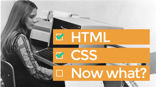
Now what?
Useful Frontend Skills:
- Practice! ☺
- Try to recreate themes on 365PSD.com, Pinterest, etc.
- You can also TA for Girl Develop It!
- Photoshop
- Javascript
- Version Control (e.g. Git)
Now what?
Useful Sites to Join or Follow:
- GitHub — see the next Bonus Material slide
- StackOverflow — try answering some questions!
- CodePen — try joining a live coding session!
- CodeAcademy
- ... and any of the inspirational sites listed on http://anything.codes
Also, GDI is a super nationwide network of techie ladies!
Bonus Material:
Getting Your Site Online
Press the down arrow or spacebar to view
Method 1: GitHub
GitHub is free and a great intro to version control
A version control system records changes to a file or set of files over time so that you can keep track of changes and roll back to previous revisions
Almost every web agency uses a version control system
http://anything.codes is hosted for free on GitHub! See?
Method 1: GitHub
- Create an account on GitHub.com
- Download GitHub Desktop, then open it and login
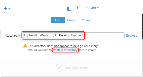 Click the plus sign and, under the Add tab, browse to the project folder you used for this class
- An error message will display; click create a repository
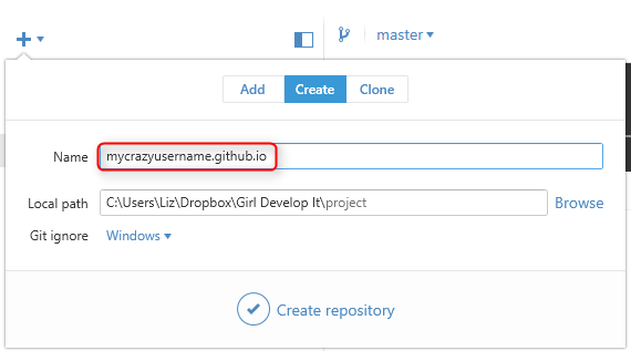 Change the Name to yourusername.github.io (substitute yourusername with your GitHub username)
- Click Create repository (Don't worry about changing Local path or Git ignore)
Method 1: GitHub
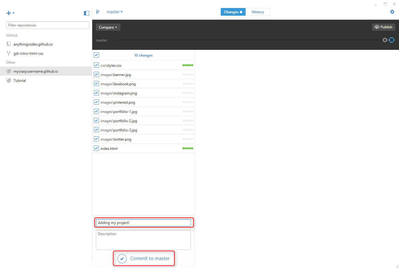
- Click Changes, where you should see a list of project files.
- Enter a Summary and click Commit to master
Method 1: GitHub
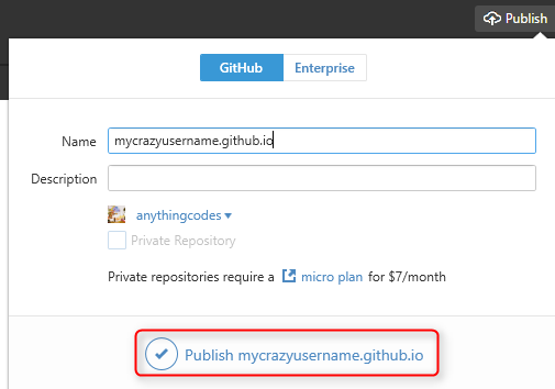 Click Publish at the top, making sure Name is in the correct format (yourusername.github.io, except with your username)
- Within a few minutes, your site will be live at http://yourusername.github.io (substituting your GitHub username for yourusername). Check it out!
- Any time you make changes to your project files, open GitHub Desktop, Commit (step 8) and then click the
 button to publish your changes.
Method 2: Hosting + Domain
There are two paid services involved:
- Web Hosting: A computer (a.k.a. server) where your site's files are located, which is visible to the outside world using a browser
- To publish changes to your site, you upload individual files from your computer to the server using a File Transfer Protocol (FTP) program such as Filezilla
- The web hosting company will give you FTP info
- Domain Name: The name you type in to the browser (e.g. anything.codes or girldevelopit.com)
- Buying a domain is often called registering, so companies that sell domain names are often called Domain Name Registrars
Method 2: Hosting + Domain
You can buy hosting from one company and a domain name from another, but it's usually less of a hassle to buy both from the same company
I use 1&1's Starter package, since it includes hosting and one domain name
When it comes to hosting, don't be fooled by the extra bells and whistles — if you aren't sure what something is, you probably don't need it
Method 2: Hosting + Domains
Why are there two separate services?
First, your files need to be stored on a web host, which is a computer (a.k.a. server)
When you register a domain, it doesn't 'point' to the server where your files are located
This is why your web host may give you a Domain Name System (or DNS) address, which is the IP address of the computer (a.k.a. server) where your files are located
The Domain Name System (DNS) is a huge list that links your domain name (e.g. anything.codes) to where your files are located (using the IP address of the server where your files are located)
Answers to Questions
- Best Content Management System (CMS) to use for a client who doesn't code
- Bootstrap
- Building Your Portfolio & Reputation
Freelance Sites:
- Power to Fly
- Guru
- Elance
- Fiverr
- ... and try to make your own portfolio site!
Thank you all!
You are all awesome! Please keep in touch!