Code Your Own Website

Intermediate HTML + CSS
Class 1
Welcome!
Girl Develop It is here to provide affordable and accessible programs to learn software through mentorship and hands-on instruction.
Some "rules"
- We are here for you!
- Every question is important
- Help each other
- Have fun
First Things First
Tell us about yourself.
- Who are you?
- What do you hope to get out of the class?
- What's your spirit animal, and why?
First Things First
Thank you to our wonderful TAs!
Course website: http://anything.codes
Instructor contact info: lizs@girldevelopit.com
Today's Project
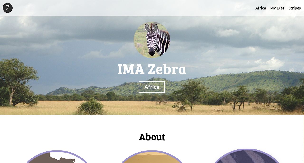
We'll be jumping into HTML/CSS right where the beginner class left off
CSS Reset
A block of CSS rules that reset all default styles
Why?
- Some HTML elements have default styles
- Sometimes these default styles interfere with how we'd like our pages to look
- Different browsers have different default styles
- A reset gets rid of these inconsistencies, and zeroes the styles
A reset lets us start from a clean slate
CSS Reset
How to use a CSS reset
- Find one online (Example ») and copy the CSS reset
- Paste the CSS reset at the top of your CSS file
- Do this before starting any project from now on ☺
CSS Reset
Example
See the Pen CSS Reset - Before by Liz Shaw (@anythingcodes) on CodePen.
Get Started: Folder Structure
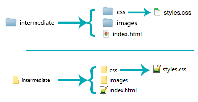
Go ahead and create your folders
Ignore the HTML and CSS files for now
Get Started: Images
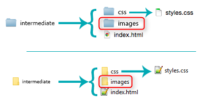
- Go to http://tinyurl.com/gdiimages to download images.zip
- Open images.zip
- If you're using Windows, 'Extract' images.zip
- Place the unzipped images in the 'intermediate/images' folder you just created
Get Started: Files
- Open your text editor and create a new file.
- Save it as index.html in the 'intermediate' folder you created earlier.
- Add the fundamental structure (a doctype, head, title and body).
- Create a new file in your text editor. Save it as styles.css in the 'intermediate/css' folder you created earlier.
- Now let's add a CSS reset to styles.css!

HTML5
HTML5 is the latest version (version 5) of HTML
All modern browsers support HTML5
HTML5 Benefits
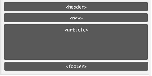
HTML5 elements are more semantic (e.g. compared to <div>)
Semantic means the tag name says what it does
HTML5 Benefits
Semantic Elements
Using semantic HTML5 elements makes it much easier to read, write, and understand your code
It's also great for Search Engine Optimization (a.k.a. SEO) and accessibility reasons (e.g. visually-impaired people using screen readers)
Let's Develop It!
Let's use block-level HTML5 elements to layout our header and banner (a.k.a. hero)
Why is HTML5 Super?
Interactive Features
HTML5 has a lot of new interactive elements, including <canvas>, <svg> (example 1 and example 2), and <video>
Why is HTML5 Super?
HTML5 works on all devices
These new features replace the need for Flash videos, which Apple devices don't support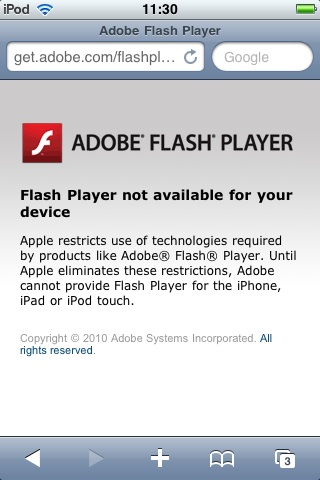
CSS Image Replacement
CSS image replacement is a technique of replacing a text element (usually a heading) with an image
For example, you may want to use a <h1> for accessibility and SEO benefits, but want to show a logo instead of text
selector {
    background-image: url('images/yourimage.png');
    width: 300px; /* the width of your image */
    height: 300px; /* the height of your image */
    white-space: nowrap;
    text-indent: 100%;
    overflow: hidden;
}
CSS Image Replacement
See the Pen CSS Image Replacement - Before by Liz Shaw (@anythingcodes) on CodePen.
CSS Image Replacement
Image too big?
Use background-size: contain; to contain the background within a smaller width and height
Let's Develop It!
Let's use CSS image replacement on our <h1> to show our logo instead of text
Positioning Recap
position: relative;
See the Pen Relative Positioning by Liz Shaw (@anythingcodes) on CodePen.
position: absolute;
See the Pen Absolute Positioning by Liz Shaw (@anythingcodes) on CodePen.
Corraling an absolute element inside any non-static (e.g. relative) element
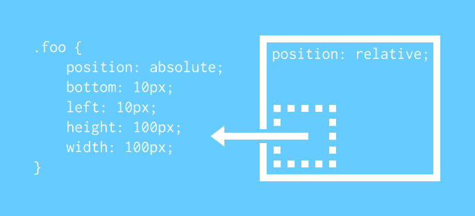
See the Pen Limiting an Absolute Element's Scope by Liz Shaw (@anythingcodes) on CodePen.
Property: float
When an element is floated, subsequent elements wrap around it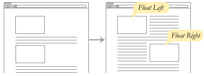
See the Pen Float - Before by Liz Shaw (@anythingcodes) on CodePen.
But wait, there's more!
Fixed Positioning
selector {
    position: fixed;
}
To make an element scroll with the browser window (a.k.a. the viewport), use fixed positioning
Unlike static elements, a fixed element can overlap other elements
Fixed Positioning
Fixed positioning is often applied to a page's header
Examples:
Fixed Positioning
Setting the Location
Use the top, bottom, right, and left properties to set the location
These values position the element relative to the viewport so that it scrolls with the page
Fixed Positioning
See the Pen Fixed Positioning - Before by Liz Shaw (@anythingcodes) on CodePen.
Let's Develop It!
Let's use fixed positioning to style our header, and style our navigation menu while we're at it
The Banner (a.k.a. Hero) Section
A large banner image, prominently placed on a page, generally in front and center
Use several CSS properties — background-image, background-size, background-repeat and height — together to make a scalable responsive banner
Use background-size: cover; to scale the image to the largest size such that both its width and its height can fit inside the content area
Let's Develop It!
Let's start styling our banner section
Next Week
Beyond Layouts — Shaping Elements, Custom Fonts, CSS Animations, & More Advanced CSS Goodness
If you haven't already, try to use each of the CSS properties discussed today. Next week we'll pick up the pace and apply some cool cutting-edge CSS. We'll also start talking about responsive development!